forms and views
In previous lessons we have seen how to define the
context of an OBEROn application and create the user menu. In this chapter,
we will define other two basic elements for each OBEROn application: the
form and the view. Forms are basically applied to single object / link instances while views have a table structure and can manage multiple instances as result of a query or a navigation.
Creating forms
The forms can be of two types: those viewing / editing data
and those for the selection of filters for searches. Moreover, a
form can be applied to objects or links and in these cases it can
be used to create new instances or to manage existing ones.
The form defined in OBEROn are generic: their actual implementation
depends on the detalied level of user interface. For example, in a
web application the form should have a render that fits the context
of a web page, while in a desktop application, there will be an
engine to make rendering for the used graphical format (for example
the eclipse SWT) and the same in a mobile application.
Users enabled
to manage Forms (see user
access rights  )
can create a new form instance by clicking the "Add
new Form" button from the "Context Design" menu and
compile the relative information. )
can create a new form instance by clicking the "Add
new Form" button from the "Context Design" menu and
compile the relative information.
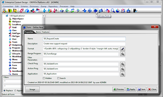
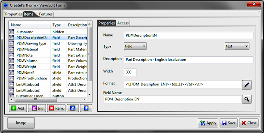
A form consists of general properties and of a set of items;
in the first tab you can specify the following options (in addition
to the usual "Name" and "Description"):
- the format - is a field where you can introduce optional
information to describe the form format; the usage of this field
depends on the application's rendering engine. For example, you
can define here the default dictionary section where search the
label translations or the form style or other custom parameters.
The wizard pop-up will help you to compile this field setting the
more common options.
- the range program - is a program used to compute the list
of values for the form-items. For example, when a form item represents
a selection control, the combo options are automatically loaded
by executing this program. The same program is executed more times,
for each item that requires the computation, so you have to write
a program code
where the result depends on the form-item (or field) name passed
as input.
- the filter parameters - the item visibility depends usually
on the object current stage or other object's parameters; with these
options you can indicate a list of object's parameters (or the Object_GetBasicOption
syntax without the brackets), used to determine if a single item
will be showed or not. Indicating the dependencies into this field
avoids to recompute the object's parameter values for each item
inside the "item-visible
"
trigger.
- the check program - this program checks the form item values
before submit the form. Receiving the values from the framework's
environment, the program
can examine their validity.
- the action program - this program performs some actions
after the form is submitted (used for example to create and connect
additional objects or to send notifications).
- the search flag: when it is active, the rendering engine considers the form as a set of filters for a database query.
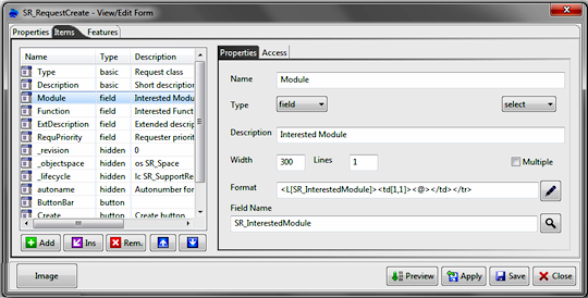
The second tab let you to specify the form's items.
It is an ordered list where you can add, remove, insert into a specific
position, or move the items. Each item is characterized by a name
(unique), a description and some properties that define its
behaviour. In particular:
- type - defines the main characteristic and
establishes what the item represents inside the form. You can choose
from different types of behaviour:
|
Type |
Description |
| |
basic |
The item is connected to an object/link basic
parameter (like class, name, description, currentstage, linktype
...). When the item is editable you can create new object/link
instances setting the basic properties or edit/change these
properties for existing ones. |
| |
field |
The item is connected to an
object/link field. When the item is editable you can set/change
the field value. |
| |
xfield |
The item is connected to an extra object/link
field. When the item is editable you can set/change the field
value. This kind of filelds is used to define a unique form
for creating multiple objects and connect them togheter by an
action program. |
| |
action |
Action input; is a parameter
not directly linked with object/link properties, but can be
used inside the form to determine other properties like basic
or field values. It can be used also inside action / range /
check programs to set a specific form's behaviour. |
| |
hidden |
Is a hidden parameter with a fixed value. Very
useful in the object creation for setting fixed parameters like
the objectspace, the class, the autonumber and so on. |
| |
get |
Static text - extract data from
the object (see the object show OOQL command) |
| |
getlink |
Static text - extract data from the link (see
the link show OOQL command) |
| |
section |
Section separator: starts a
new block with a given title |
| |
spacer |
Line Break: introduces a blank space with a specific
height |
| |
href |
HTML Link / URL (*) |
| |
label |
Static label/text |
| |
img |
Image object with a specific
source URL (*) |
| |
embed |
Embedded object (like flash, shockwave, applets)
with a specific source URL (*) |
| |
button |
Button: used to perform any form action (*)
A button bar starts with a special "button"
item with button text equals to "<BAR>" and
ends with another special "button" with button text
equals to "</BAR>"
|
| |
navigate |
Navigation table: navigates the object with given parameters
and presents the list of connected objects. You can apply
a view to the list to show some specific properties and activate
some action buttons to create, connect, disconnect and delete
object in the list.
|
| |
form |
Include another (sub) form.
This is very useful when you have a class hierarchy and the
sub-classes introduce additional object fields: by creating
a main form you can define sub-forms only for these additional
fields. The platform will select the sub-form automatically
on the base of the object class. |
| |
|
|
| |
(*) Inside the item URL or the
button action you can use the key substitution; for example,
using:
files.jsp?id=<id>&desc=<description>&date=<origdate>
the keywords <id>,<description>,<origdate>
will be replaced with the respectively values |
The "basic", "field", "xfield"
and "action" item types can be editable and you can choose
for them a control type for the user interface by selecting it from
the following list:
| |
text |
single-line text input control

|
| |
textarea |
multi-line text input control
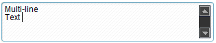
|
| |
select |
combo list or menu; you can define the number of showed options
and the number of selectable options
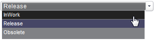
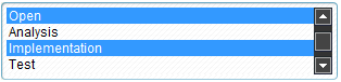
|
| |
checkbox |
on/off switches that may be toggled by the user; allow users
to select several values for the same property
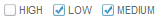
|
| |
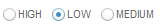
radio |
on/off switches that may be toggled by the user; they are
mutually exclusive: when one is switched "on", all
others for the same property are switched "off"
|
| |
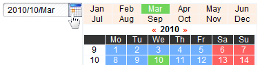
date |
single-line text input with date picker
|
| |
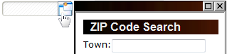
popup |
single-line text input with selector popup
|
| |
hidden |
hidden control. This control can receive the
value from the page request, or change the value on the base
of other controls. |
- width and height/lines - are the horizontal
and vertical dimensions; not all the item types and the control
types support these properties. Some controls like "select"
and "textarea" consider the height as the number of visible
lines/options.
- multiple - is supported only for select controls and establish
if you can select multiple options.
- format - is a field where you can introduce optional information
to describe the item format; the usage of this field depends on
the application's rendering engine. You can use the wizard to set
the appropriate value for this field.
- item value - its meaning depends on the item type: for
"basic", "(x)field" and "action" it
represents the Basic Name, the Field Name and the Parameter Name
respectively; for the "get", "getlink", "navigate"
represents the OOQL expression to compute the value or the object
list; for "section", "button" and "label"
it is the showed text; for "href", "img" and
"embed" it is the (source) URL; for the "hidden"
type is the fixed value passed for the hidden parameter.
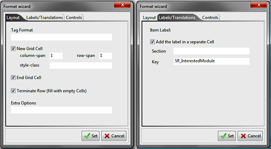
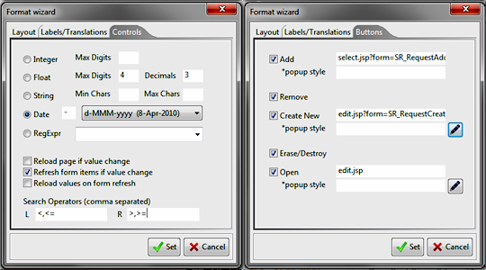
As said before, the Format wizard help you to define
the item format property. The settings depend on the selected item
type and the control type:
- the Layout tab allows to set the main properties like
the HTML layout or the tag format; in particular everything you
write into the tag format will be reported into the html tag, for
example you can set here the html tag attributes "style",
"class", etc. For the "navigate" type, this
option represents the view name applied to present the navigation
result. The other options let you to create the form layout adding
the <td> </td> </tr> html tags before and after
the element.
- the Labels/Translations tab can be used to specify the
dictionary key and section (if not specified will use the form default)
for the label translation. You can also indicate if this label is
or not placed into a different table cell.
- the Controls tab defines both
the item output format and the input format in case of editable
control. In particular, you can set the limits for integer, float
and string values or set the date format for the date type controls.
These settings are important during the form's pre-validation.
In this tab you can also define the control change behaviour; if
you set:
° Reload page if value change, this means that every
time the user acts on the control and changes the value or the selection,
the page including the form will be reloaded and all other control
values refreshed. This is useful when you need to show or hide some
items on the basis of the item value.
° Refresh form items if value change, this means that
when user change the control value, the other sensible controls
will be refreshed without reloading the page.
° Reload values on form refresh, this defines the control
"sensible": its value or the list of possible values will
be reloaded when another control causes the form refresh.
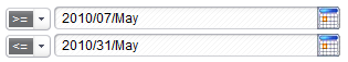
The search operators can be applied to "text" and "date"
controls; if you specify the left (L) [and the right (R) operators]
the user will be able to define a range for a search filter. The
operator should be separated with comma: for example if you set
[==,>=,>] for the (L) and [<,<=] for the (R) the user
will be able to select blank, ==, >= and > in the first
selector (low limit) and blank, <, <= in the second
(high limit).
- the Buttons tab is enabled only
for the "navigate" type and let you to choose which buttons
will be showed and their related click actions.
The last important aspect we have to focus
is the item visibility and/or the item access. We don't want to
create a form for each condition or for each user role; the same
form can be applied for several usages even if you have to introduce
little changes to support different users and system conditions.
OBEROn lets you to control each form-item visibility/access simply
defining access rules for it.
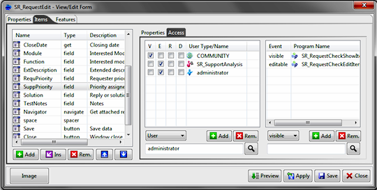
First of all you can set if an item is
visible (V) to all users and if it is or not editable (E), required
(R) or disabled (D) for everybody. The community flags let you to
specify these conditions. Moreover, you can set the access (V,E,R,D)
for specific users / teams / assignments; the result for the current
user is the logical OR of all conditions (community OR user itself
OR team membership OR user assignment ).
Finally, if this is not sufficient you can define the "visible
/ editable / required / disabled "
programs to check the visibility, the editability and the other
options. These programs receive, as input arguments, the filter
parameters declared in the form properties panel and all the
form's current values (set by the user and stored inside the framework
environment).
They work in negative logic: they can perform all system queries
needed for the checks and can raise exceptions to disable a particular
condition. For example, if you want disable the editability for
a specific field, you may activate the editable flag for the community
and define an "editable" trigger: when the program fails
depending on a particular situation, the field will not be editable
for the current user.
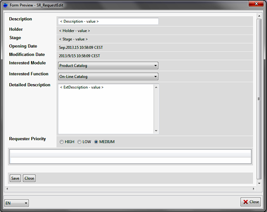
Form preview [since 4.1]
Forms are dinamically created at the high level of the user interface on the basis of the definition made inside the generic level. The Preview tool simplifies the work for administration users because they can immediately verify how will be the general look, the position of fields , the validation checks and if field values are loaded correctly. Moreover, it is possible to test the localization by selecting the language among those defined into the dictionary.
Form wizard [since 2.4]
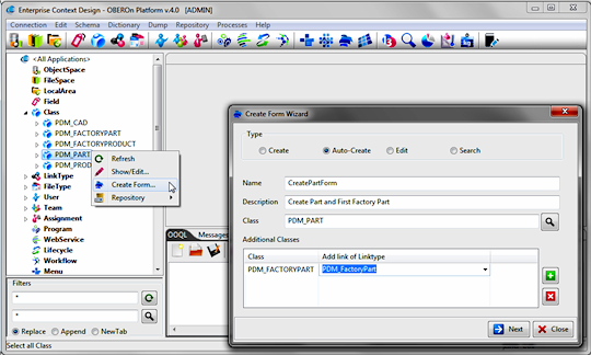
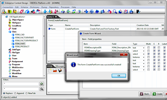
Creating a new form can be an annoying activity specially when the form is used to create or edit object instances and you have to define items for each object-class field. The form wizard helps you to create faster this kind of forms (they are the majority): from the navigation tree select the class of object to manage, right click on it and select "Create Form..". This action will open the form wizard tool; here you can specify the name and the type of form to generate (create new object for this class, create with autonumber, edit object instances or search for this kind of objects) and also set a description for the new form. In addition, you can define a more complex form where in a single user interface mask you put fields of secondary classes in a way that, at the same time, on the form submit action, you create instances of main and additional classes and connect them togheter with the specified linktypes.
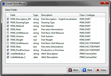
The second panel lists the fields for the main class, the secondary classes and the fields for the specified linktypes. Here you can choose the item to put inside the form.
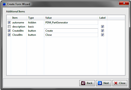
In the next panel, additional items like the autoname, basic/hidden parameters and buttons can be selected and configurated:
Finally, in the last panel you can specify main properties for each form item: the item-control type, the editable (E) and the required (R) condition, the multivalue option.
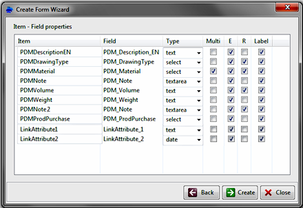
The generated form is ready to be used in a web or a desktop application; secondary class fields and link fields are created as "xfield" items. You can move the items up/down to define the correct order or organize the layout (all items are placed by default on a single column).
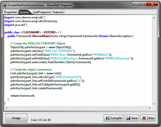
When a form involves more than one class, a action program is automatically generated, the aim of this program is:
- create / auto-create forms: generate the object instances of secondary classes, set up their fields, add connection of specified linktype between the main class object and them, set the link fields for the new links.
- edit forms: retrieve the object instances of secondary classes connected with the specified linktype, update the object and link fields for them on the base of input values.
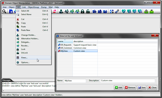
Creating views
A view is substantially a table header: it defines a set of columns in a specific order used to show or edit properties for multiple objects. A view can be general or created for a single user: general views are defined in the "Context Design" console and they are common to all users for some application purpose. At the contrary, a view created by / for a single user is visible only for him.
The view defined in OBEROn are generic: their actual implementation
depends on the detalied level of user interface. For example, in a
web application you can use tools like displaytag for creating the table structure based on the view definition and in a desktop application you can instead display the view structure by using the SWT Table / Tree widgets.
Users enabled
to manage general purpose Views (see user
access rights )
can create a new view instance by clicking the "Add
new View" button from the "Context Design" menu and
compile the relative information.
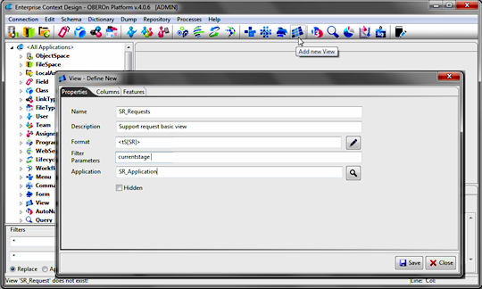
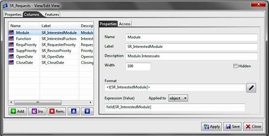
A view consists of general properties and of a set of columns;
in the first tab you can specify the following options (in addition
to the usual "Name" and "Description"):
- the format - is a field where you can introduce optional
information to describe the view format; the usage of this field
depends on the application's rendering engine. For example, you
can define here the default dictionary section where search the
label or data translations or the view style or other custom parameters.
The wizard pop-up will help you to compile this field setting the
more common options.
- the filter parameters - when the view is used to show navigation elements, the column visibility may depend
on the root object (generally the current stage or other object's parameters); with these
options you can indicate a list of root object's parameters (or the Object_GetBasicOption syntax without the brackets), used to determine if a single column will be showed or not. Indicating the dependencies into this field
avoids to recompute the object's parameter values for each column inside the "column-seeable "
trigger.
Custom views can be created in the "Domain Object Manipulation" console by selecting the Edit/Views.. menu command. If the logged user is enabled to manage general purpose Views he can edit here also the common views, otherwise, it will able exclusively to create / remove and edit its own views.
The second tab let you to specify the form's columns.
It is an ordered list where you can add, remove, insert into a specific
position, or move the columns. Each column is characterized by a name
(unique), a description and some properties that define its
behaviour. In particular:
- label - it is the column title; it is visible in the table header and generally it is translated through the dictionary, according to the dictionary section defined in the view's general format.
- width - it is the minimal column width but this value can be ignored in the rendering process.
- hidden - when this flag is activated, the column will be hidden for all users; the low level user interface computes the column values anyway and the mechanisms for hiding the column must be implemented at the high level UI.
- format - is a field where you can introduce optional information
to describe the column format; the usage of this field depends on
the application's rendering engine. You can use the wizard to set
the appropriate value for this field.
- expression value - it represents the OOQL expression to compute the columns values for displayed objects. The expression can be applied to the object or to the link when the data are derived from a navigation process. If you apply the view to a query result, the columns related to link expressions will be discarded.
The last panel allows to
define access rules for the column visibility and for the faculty of apply modification to the displayed data. We don't want to
create a view for each condition or for each user role; the same
view can be applied for several usages even if you have to introduce
little changes to support different users and system conditions.
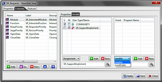
First of all you can set if an item is
seeable (S) to all users and if it is or not modifiable (M) for everybody. The community flags let you to
specify these conditions. Moreover, you can set the access (S,M)
for specific users / teams / assignments; the result for the current
user is the logical OR of all conditions (community OR user itself
OR team membership OR user assignment ).
Finally, if this is not sufficient you can define the "seeable
/ modifiable "
programs to check the visibility and the editability access. In case of navigation of a reference object, these programs receive, as input arguments, the filter
parameters declared in the view properties panel (the values are computed for the root element).
The access programs work in negative logic: they can perform all system queries needed for the checks and can raise exceptions for disabling a particular condition. For example, if you want disable the visibility of a specific column, you may activate the flag for the community and then define an "seeable" trigger: when the program fails depending on a particular situation, the column will be hidden for the current user.
|


